

I love when a client approaches me for both branding and a website. Helping a client develop their brand strategy and carry it through multiple platforms is one of the most rewarding and enjoyable aspects of my job.
Mel is one of those incredibly talented people who can do just about anything. She is a fantastic producer, director, editor, and writer who’s worked in both TV and film. When she approached me about creating her personal brand, I knew we’d have a great time capturing Mel’s energy and eye for clean design.
STEP 1: BRAND QUESTIONNAIRE
As with all of my branding projects, I had Mel fill out a questionnaire explaining her audience, her plans for reaching that audience, any competitors, and words she would use to describe her aesthetic. The questionnaire also asks, “If her brand were a person, what would be their personality and interests?”
Using the information Mel supplied, we developed the following aspects of her brand persona:
- Energetic
- Inventive
- Casual
- Dark
- Minimalist
- Modern
- Geometric
STEP 2: MOOD BOARD After familiarizing myself with a brand’s core identity, I always create a mood board to collect a visual record of the client’s ideas. The mood board also serves as a gut check to make sure we haven’t lost sight of the brand’s unique identity.
Mel’s mood board, which included sleek lines and modern, geometric textures, helped me stay focused on Mel and her brand as I worked through fonts, colors, and logo ideas.

STEP 3: LOGOS
As Mel and I talked through the mood board, the dominant themes that began to emerge were minimalism and modernity. I’ve known Mel since college, so I know that she has some moxie to her personality that I wanted to bring out in the designs as well.
By designing a range of logo options, I hoped to give Mel a chance to see her brand in different lights, from abstract and minimalist to more literal and casual.
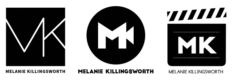
Option One – Clean and Geometric Option One plays with her initials, but uses the letters themselves to create a geometric pattern.
Option Two – Bold, Minimal with Softer Edges Option Two uses the negative space from the K in her initials to create a subtle camera shape. The bolder font gives this option an energetic and slightly cheeky feel.
Option Three – Clean, Literal Option Three veers more toward the less prominent aspects of her brand persona, casual and energetic. While the shape of the logo is more literal to her field, the design is still clean.
Without hesitation, Mel felt immediately drawn to the second option. We played around with a few changes to the other logos, but Option Two remained the clear winner.
STEP 4: BRINGING IT ALL TOGETHER
Once we established a logo, I selected fonts, colors, and design elements. The finished package incorporates Mel’s unique voice into a cohesive brand identity.

NEXT STEPS: WEBSITE
Now that the design elements of the brand have been established, I’m working with Mel to incorporate those ideas into a website. The site is currently under construction, and I hope to share the next phase of this exciting project soon!